Frappe Cloud
Marketplace
Search for an app
Frappe
Products
Insights

Installation Guide
installs
Publisher
Supported versions
Categories
E-Commerce


About
What is Productify?
At FinByz, we firmly believe productivity thrives on efficient time management. We've designed Productify – a powerful tool to put this belief into practice, enhancing time management and fostering productivity in the workplace.
Designed to streamline your workflow and enhance your productivity, Productify is available as a software application as well as a browser extension. It works seamlessly on Google Chrome, Microsoft Edge and Brave browsers. Regardless of your workforce being geographically dispersed or operating from a centralized office, Productify offers robust insights and controls to boost productivity and enforce stringent data security measures.
Productify is divided into two parts – Activity Analysis dashboard and comprehensive Summary Reports. These features can be viewed in the ERP, by both the management and the employees. This access can promote transparency, self-monitoring, and accountability. It also helps foster trust and ensures that the use of tracking apps aligns with both company goals and employee rights.
Unlock the full potential of Productify with these outstanding features -
1. Total Activity Summary
2. System Activity
3. Web Browsing
4. Phone Calls Analysis
5. Meetings Analysis
Activity Summary
Our Activity Summary feature provides a comprehensive overview of your workday by breaking down your time into clear categories. The activity summary report and the detailed activity analysis dashboard help you understand how your time is spent and identify opportunities for improved efficiency.
Activity Summary Report:
This report provides a comprehensive view of your workday in terms of a Line Chart. The line chart tracks four different metrics over the specified time period -
· Total Hours
· Active Hours
· Calls Hours
· Meetings Hours
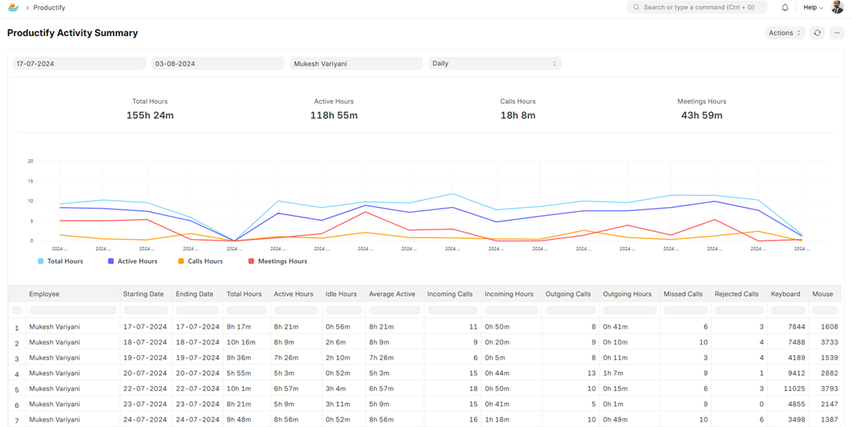
After entering the from/to dates and employee name, you can select the frequency between Daily, Weekly and Monthly. The accompanying table offers a detailed breakdown of various productivity-related activities - Total Hours, Active Hours, Idle Hours, Average Active, Incoming Calls, Incoming Hours, Outgoing Calls, Outgoing Hours, Missed Calls, Rejected Calls, Keystrokes and Mouse Clicks recorded.
Activity Analysis:
1. Activity Summary:
A detailed visual representation in a Gantt chart of an employee's daily activities over a specific period. Each row corresponds to a day, and the time (working hours) is divided into various activity segments. The activities are color-coded to distinguish between different types of tasks, such as application use, idle time, internal meetings, external meetings, calls, and periods of inactivity.
Here is what you will find in Activity Summary –
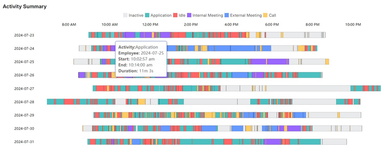
Total Time is measured as a sum of active time and inactive time.
a. Active Time -
· Applications: See how much time you spend using various software applications on your system.
· Websites: Get insights into the websites you visit most frequently, and the time spent on each.
· Internal Meetings: Track team meetings to gauge your collaborative efforts.
· External Meetings: Review the time spent in meetings with clients, partners, customers, or other external contacts.
· Calls: Monitor the time spent on calls to understand your communication patterns better.
b. Inactive Time -
· Idle Time: Identify periods when your system was idle, which can help you pinpoint times of inactivity or distraction. You can also log meetings by clicking on the idle time or inactive time.
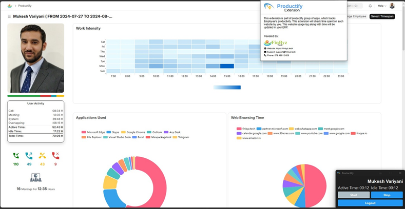
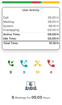
2. User Activity:
This summary presented by a progress bar chart calculates the total
time spent by the selected employee, which includes active time spent on
calls, meetings, and their system. It also takes idle hours and hours that
overlap into consideration.
Along with Total Time, the User Activity summary shows incoming calls, outgoing calls, missed calls and rejected calls as well.
The bottom section highlights the number of meetings and the total
hours spent in meetings. This visualization aims to offer a snapshot of
the employee's productivity and engagement throughout the
specified time period.
System Activity
Work Intensity:
By tracking keystrokes and mouse-click activity, our Work Intensity visual provides valuable insights into how actively your team is working. Are they focused and fully engaged? Or are they struggling to stay productive? The data speaks for itself!
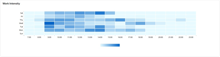
The Work Intensity feature monitors the number of keystrokes and mouse clicks made by each employee, offering a real-time indicator of their engagement and activity levels throughout the week for each workday. The Heatmap lets you monitor activity in real time and identify your work patterns by the hour. The more you click, the darker the heatmap will appear!
Applications Used:
In a world where productivity is paramount, understanding how your team interacts with software can unlock new levels of efficiency. By knowing which tools are most impactful and where time is spent, you can optimize software usage and enhance overall productivity.
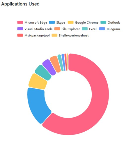
This feature is designed as a Doughnut Chart to give you insights into how the employees engage with the software tools they rely on. This interactive visual gives you a detailed view of application usage - each arc in the doughnut represents an application, and each application is represented by a different colour. By hovering over any of the arcs, you can see the number of hours spent on that app.
The legend shows which colour is assigned to which application. You can also unselect applications by clicking on them in the legend. Once an application is unselected, the arcs change, and its data is not shown in the doughnut anymore. You can also hover over any applications in the legend to see the hours spent on it. This way you can get insights on exactly the applications that you want.
User Activity Images:
From the moment you start your day until you log off, see exactly what you were working on with clear, concise screenshots. The User Activity Images feature randomly captures your screen every 5 minutes, giving you a visual diary of your workday.
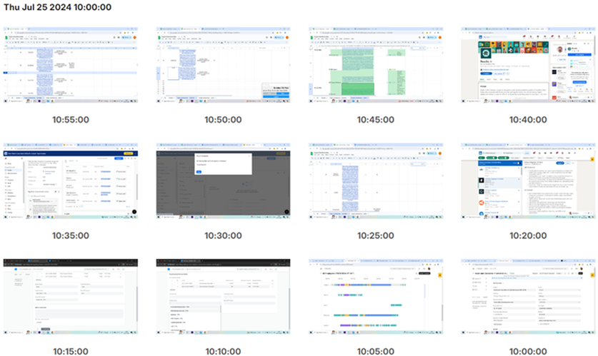
Each screenshot is logged and saved according to its timestamp. You can scroll down to the day/date you want to view and see the desired activity images.
You can interact with this feature by clicking on any image. Once the image is maximized, right-clicking on it will give you the options to open this image in new tab, copy image URL, save image, copy, create QR code, and search for it in Google.
Visualize your productivity, track your progress, and spot patterns with ease. Whether you’re working on a project or attending meetings, every key moment is captured. Gain valuable insights into your workflow, identify distractions, and make data-driven decisions to optimize your efficiency.
Web Browsing
Web Browsing Time:
With Web Browsing Time, from time spent on social media to hours spent on research or online meetings, we log it all. Do you know the time you’re spending online - and what you’re actually doing with that time?
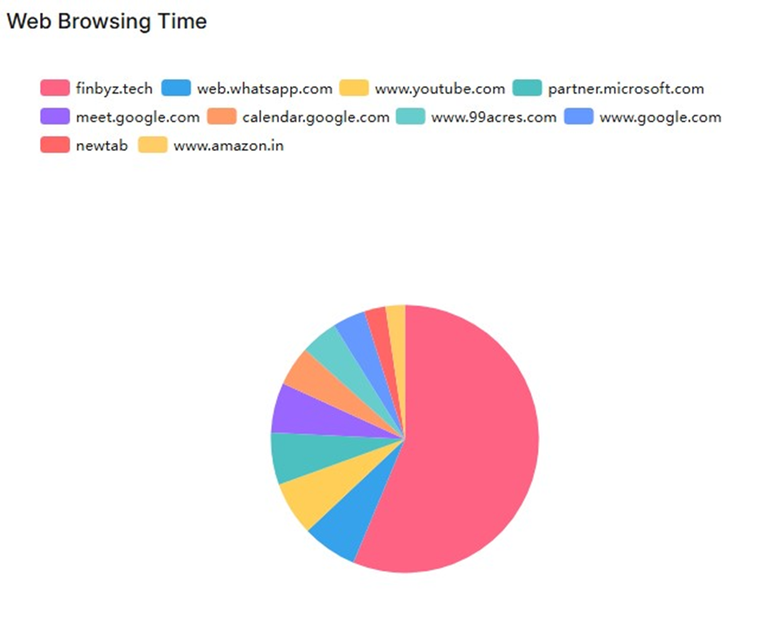
Our advanced analytics categorize your browsing into clear, easy-to-understand segments. Your web browsing time is presented in a Pie Chart. Each slice represents a different domain, and each domain is represented by a different colour. By hovering over any of the slices, you can see the number of hours spent on that domain.
The legend shows which colour is assigned to which domain. You can also unselect domains by clicking on them in the legend. Once a domain is unselected, the slices change, and its data is not shown in the pie chart anymore. You can also hover over any domain in the legend to see the hours spent on it. This way you can get insights on exactly the domains that you want.
See exactly where your time goes and uncover patterns in your online behavior. Receive daily, weekly, and monthly summaries to make informed decisions and optimize your online time.
URL Data – Top 10 Sites Visited:
Ever wondered where your time goes online? Discover your digital habits with Productify's powerful new feature – URL Data! Our intuitive dashboard highlights your most frequented sites, giving you clear insights into your online behavior.
With URL Data, you can instantly access your Top 10 Sites visited. See which websites are commanding your attention and how much time you’re spending on them.
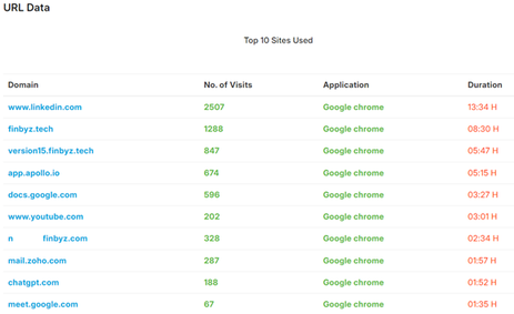
This feature provides a detailed overview of the top 10 websites the user has visited over a given time period. It documents the domain, number of visits, which application/browser was used, and the duration visited.
URL Data is an interactive visual. Upon clicking any of the 10 domains, a pop-up appears with a list of the pages visited under that domain. This list includes page title, page URL, duration in hours, and number of page visits. URLs of all the pages that were visited are listed in this pop-up and can be accessed by clicking on them. Once you click any URL, it is opened in a new tab.
The data collected using this feature allows the organization to keep track of any and all the websites the user accesses and the frequency with which they were visited. Gathering URL data from employee laptops and computers is essential for improving security, evaluating productivity, maintaining regulatory compliance, optimizing network performance, and identifying training requirements.
This feature enables the detection of security threats, analysis of employee time management, and insights into bandwidth usage. Additionally, this data can guide training efforts and support incident investigations.
However, it’s crucial to balance data collection with privacy concerns and be transparent with employees about the purpose of this monitoring.
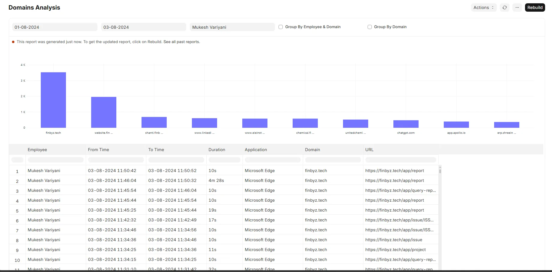
Domain Analysis Report:
The Domains Analysis Report is designed to offer an in-depth visualization of website domain usage across a specified timeframe. The interface features an intuitive selection panel at the top, allowing users to define the date range and select specific employees. Additionally, users can choose to group the data either by employee and domain or by domain alone, using the provided checkboxes.
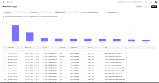
A prominent bar chart within the report illustrates the frequency of visits to various domains, with each bar representing a distinct domain and its associated visit count. This visual representation facilitates quick comparison and understanding of domain traffic. Below the chart, a detailed table provides comprehensive information about each visit. The table includes fields for the employee’s name, start time, end time, duration of the visit, the application used to access the domain, the domain name, and the URL of the visited page. This report is a valuable tool for gaining insights into web activity, monitoring domain usage trends, and analyzing how time is allocated across different websites.
To ensure that users have access to the most up-to-date information, the report also includes a 'Rebuild' button, which refreshes the data and updates the analysis accordingly.
Phone Calls Analysis
FinCall Mobile Application:
Every call contributes to organizational success. Analyze employee-customer interactions over our FinCall mobile app and capture call type, participants, and timestamp. Utilize FinCall integration to seamlessly capture and categorize call data, ensuring clarity and accuracy in your records. Get detailed insights into both internal and external communication activities, ensuring clarity, efficiency, and informed decision-making across your team.
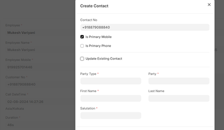
When an employee makes a phone call, the call is automatically linked to the respective contact in the Contacts saved in ERP.
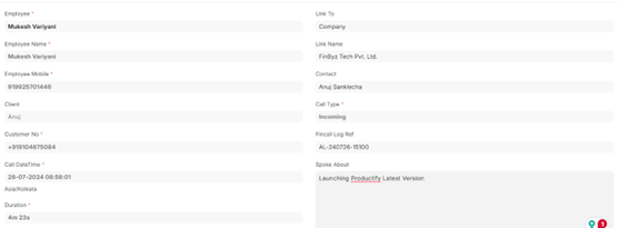
If the contact is not already saved, an option to add a missing contact is available.
Additionally, an option to add discussion details is given in the Customer, Lead, and Supplier timelines in the ERP.
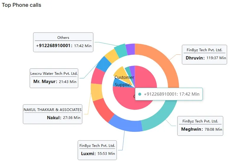
Top Phone Calls:
Our Top Phone Calls feature is designed to provide insights into your team's communication activities, ensuring transparency and efficiency across the board.
Comprehensive Call Tracking -
Monitor all calls made and received by your team members, including essential details such as contact information, call duration, and timestamps.
Utilize FinCall integration to seamlessly capture and categorize call data, ensuring clarity and accuracy in your records.
Here is what your Top Phone Calls will look like –
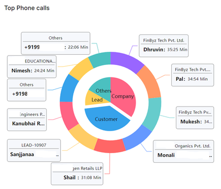
The phone calls are represented by a Pie-in-a-doughnut chart and categorized into Company, Customer, Lead and Others. The slices in the pie chart act as a legend and the doughnut arcs denote the entities with whom the calls were held. The labels show the name, company and duration. You can also see the overall duration spent by hovering over the categories.
Type of Phone Calls:
Our Type of Calls feature provides detailed insights into both internal and external communication activities, ensuring clarity, efficiency, and informed decision-making across your team.
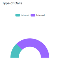
With Productify's Type of Calls feature, organizations can transform how they manage communication dynamics and optimize productivity. Embrace a smarter approach to communication management with Productify – where every call type contributes to organizational success.
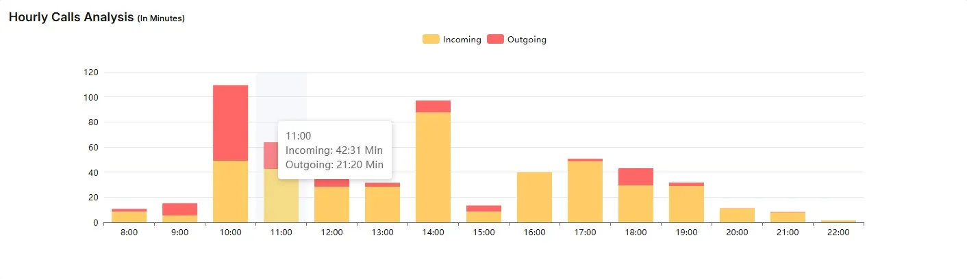
Hourly Calls Analysis:
With Hourly Calls, you gain a comprehensive view of all your calls—both internal and external—broken down by the hour. Track every internal call with your team and every external call with clients, all in one place.
See exactly when each call happened, how long it lasted, and understand the patterns in your communication. Our detailed timestamps and duration tracking let you pinpoint your peak communication hours and optimize your schedule.
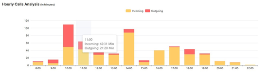
Boost your productivity by managing your calls more effectively and ensuring every minute is used wisely. With Hourly Calls, you're not just tracking time—you're mastering it.
Consolidated Analysis
Our Consolidated Analysis page brings together all the key metrics you need in one powerful interface and puts the power of data at your fingertips, helping you make informed decisions and drive your organization's success.
Document Analysis:
The Document Analysis feature shows a bar graph that depicts frequency and the type of documents that were modified in a given time period.
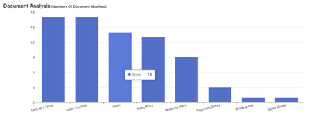
Upon hovering above a bar, you can see the number of times the specific document type was modified.
Top 10 Client Call Analysis:
The Top 10 Client Call Analysis is a pie-in-a-doughnut chart that shows the clients with the top 10 call durations in a specified time period. This is grouped by customer, company, etc. It also shows labels with names of the company and the total duration of all calls in minutes.
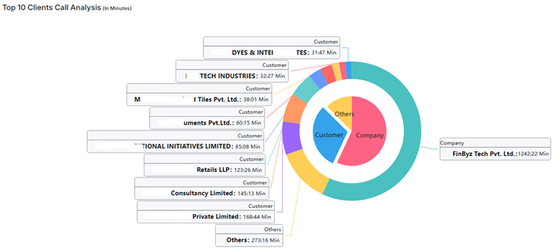
This feature helps you identify the companies with the greatest number of calls made. It helps you get insights and allows you to make decisions about time management between your clients.
Activity Summary:
The Activity Summary is shown by a Gantt chart of the time spent by all the employees on the specified day. One row represents one employee and the time (working hours) they spent performing various activities such as application use, idle time, internal meetings, external meetings, calls, and periods of inactivity.
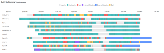
This graph can help the organizational hierarchy to identify time management patterns of their employees.
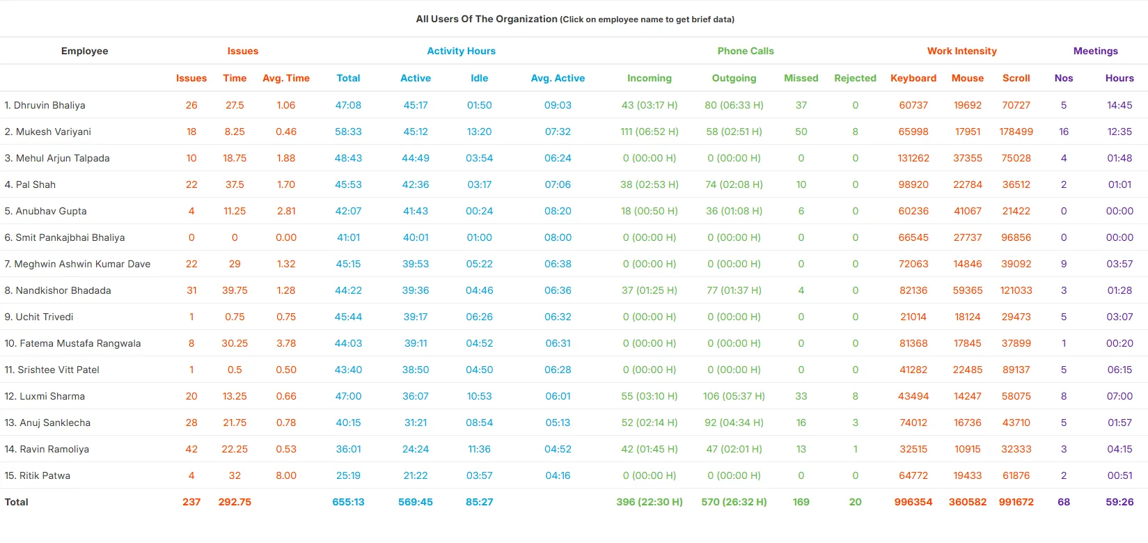
User Analysis:
The User Analysis feature gives you the productivity statistics for all employees. It shows the total time spent by the users across the system.
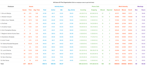
This table gives you a list of all employees of your organization, along with the following data -
· Activity hours – total, active, idle and average
· Phone Calls – incoming, outgoing, missed and rejected
· Work Intensity – keyboard strokes, mouse clicks and scrolls
· Meetings – number of meetings and hours spent
From owners reviewing consolidated employee activities to senior team members overseeing juniors, this consolidated User Analysis empowers every level of your organization to operate at peak efficiency.
User Reviews
No reviews yet, be the first to review.
0.0
0 rating
More apps from

.png)
.png)
Explore more apps